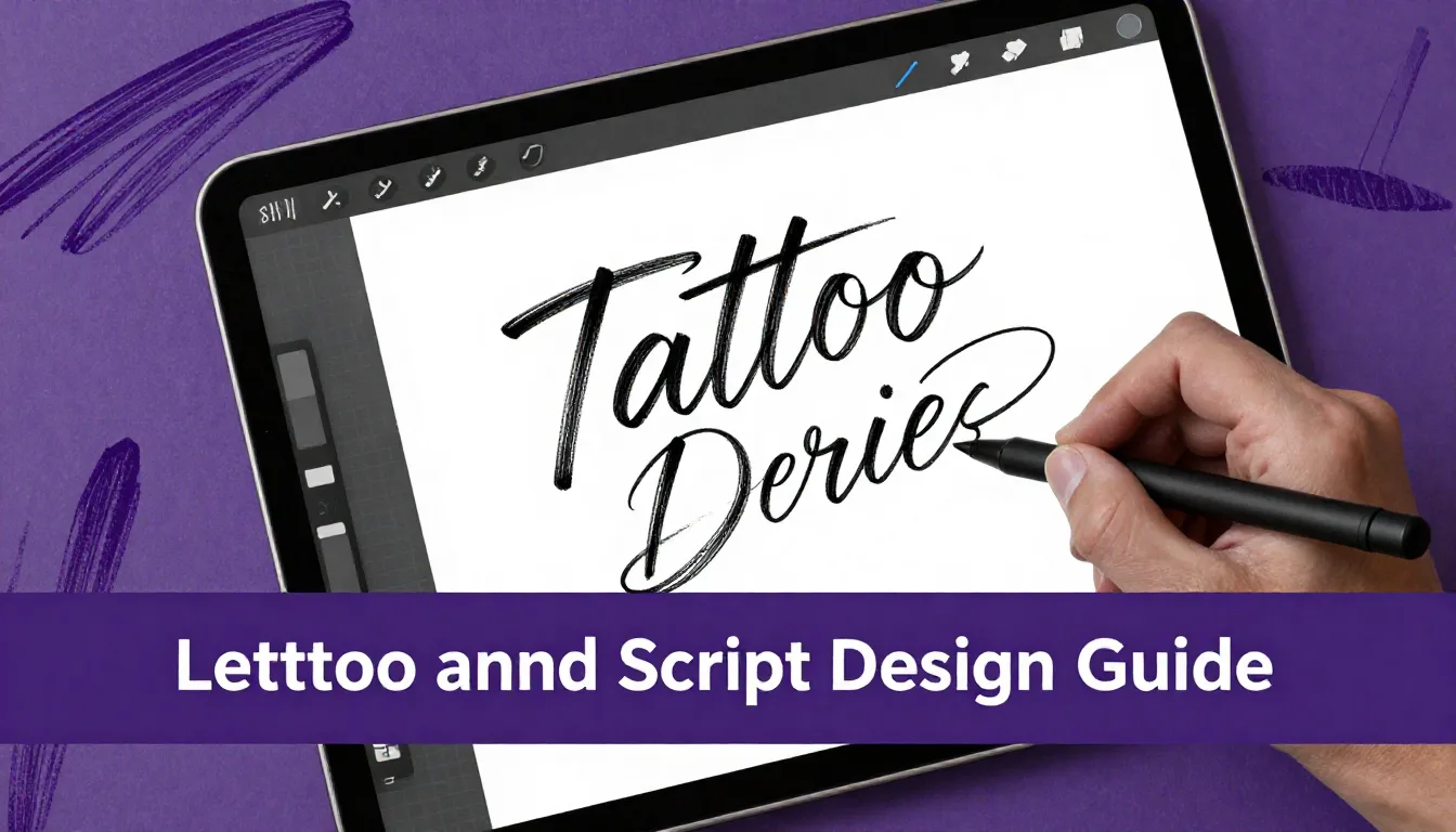
Creating flawless tattoo lettering and script requires a delicate balance of precision, flow, and structural understanding. Whether you're designing delicate fine-line script or bold Chicano-style lettering, mastering these skills digitally translates directly to better stencils and cleaner tattoos. This comprehensive tattoo digital art guide will walk you through the essential techniques for crafting professional-grade script in Procreate.
Understanding Script Fundamentals
Before diving into complex flourishes and elaborate designs, it's crucial to master the basic anatomy of letters. Every strong tattoo lettering and script design is built on a foundation of consistent baselines, x-heights, and ascenders/descenders. When setting up your Procreate canvas, start by turning on the Drawing Guide (Actions > Canvas > Drawing Guide) and editing it to create a grid that will keep your letters uniform. Practice your foundational strokes—the basic upstrokes, downstrokes, and loops—until they flow naturally from your Apple Pencil.
Setting Up Your Procreate Workspace
A well-organized workspace makes a significant difference in your workflow. For the best results in your procreate tattoo tutorial journey, set your canvas size to at least 300 DPI (dots per inch) at the physical size you intend to print the stencil. A standard 8x10 inch canvas at 300 DPI provides an excellent balance of resolution and manageable file size. Utilize Procreate's StreamLine or Stabilization settings on your brush; bumping this up to 15-30% will help smooth out those natural hand jitters, ensuring your script lines are crisp and tattoo-ready.
Mastering Weight and Contrast
The secret to dynamic, readable script lies in the contrast between thick downstrokes and thin upstrokes. This principle of calligraphy is heavily utilized in tattoo design. To achieve this digitally, you need a brush that responds beautifully to the Apple Pencil's pressure sensitivity. Apply firm pressure as your hand moves downward, and lighten up significantly as you transition into upward curves. Consistent practice of this pressure control will elevate your lettering from amateur to professional grade.
Pro Tips
- Always draw your lettering on a separate layer from your guides so you can easily hide the grid later.
- Use the Liquify tool (Push mode) sparingly to gently nudge stubborn curves or adjust spacing without redrawing the whole word.
- Flip your canvas horizontally regularly. This forces your brain to see the design as an image rather than readable text, highlighting spacing and balance errors immediately.
Flourishes and Embellishments
Once your core lettering is solid, flourishes add that custom, artistic flair that clients love. The key is balance—flourishes should enhance the readability, not obscure it. Use flourishes to fill awkward negative spaces above and below the script, often extending from the ascenders of letters like 'l' and 'h', or the descenders of 'g' and 'y'. Keep the weight of your flourishes slightly lighter than the main body of the text to ensure the actual word remains the focal point.
Preparing for the Stencil
Digital art must eventually translate to skin. When your design is complete, you need to prep it for thermal printing or hand-stenciling. Duplicate your final artwork and merge the layers. Use an adjustment layer to push the contrast, ensuring your blacks are absolute black (hex #000000). If you've used shading, convert the design to a crisp line-art version, as subtle gradients rarely translate well through a standard stencil machine. Creating a clean, high-contrast final image is the hallmark of a professional tattoo digital art guide.
Frequently Asked Questions
What is the best canvas size for tattoo lettering in Procreate?
Always work at a minimum of 300 DPI. A canvas size of 8x10 inches (2400x3000 pixels) is standard for most medium-to-large pieces, ensuring crisp lines when printed for your stencil.
How do I make my script look less stiff and more natural?
Increase the StreamLine or Stabilization setting on your brush slightly (around 15-25%), and focus on drawing from your shoulder rather than your wrist. Fluid, confident strokes always look more natural than slow, hesitant ones.
Why do my thick and thin lines look inconsistent?
Inconsistent line weight usually stems from uneven pressure on the Apple Pencil. Practice basic drills—thick downstrokes and thin upstrokes—to build muscle memory, and ensure you're using a brush configured for high pressure sensitivity.
Should I use pre-made fonts or draw my script from scratch?
While fonts can provide inspiration or a starting point, drawing from scratch ensures the design flows perfectly with the client's body placement and guarantees a unique, custom tattoo.
Ready to take your digital script to the next level? Developing your unique style takes time and the right tools. To speed up your workflow and get access to premium lining, shading, and lettering brushes specifically designed for tattoo artists, be sure to download the ProcreateTools app. It's packed with free resources and professional brush sets that will make your lettering pop right off the screen.